published under license Attribution-ShareAlike 4.0 International (CC BY-SA 4.0)copy! share!
posted in category Technology & Dystopia / Graphic Designs & UX
posted at 09. Jan '16
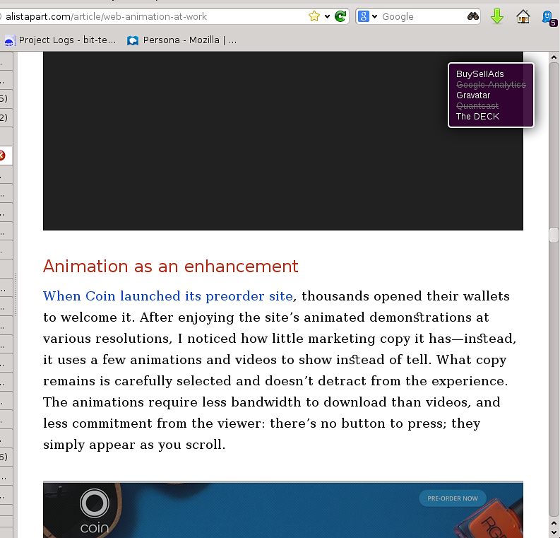
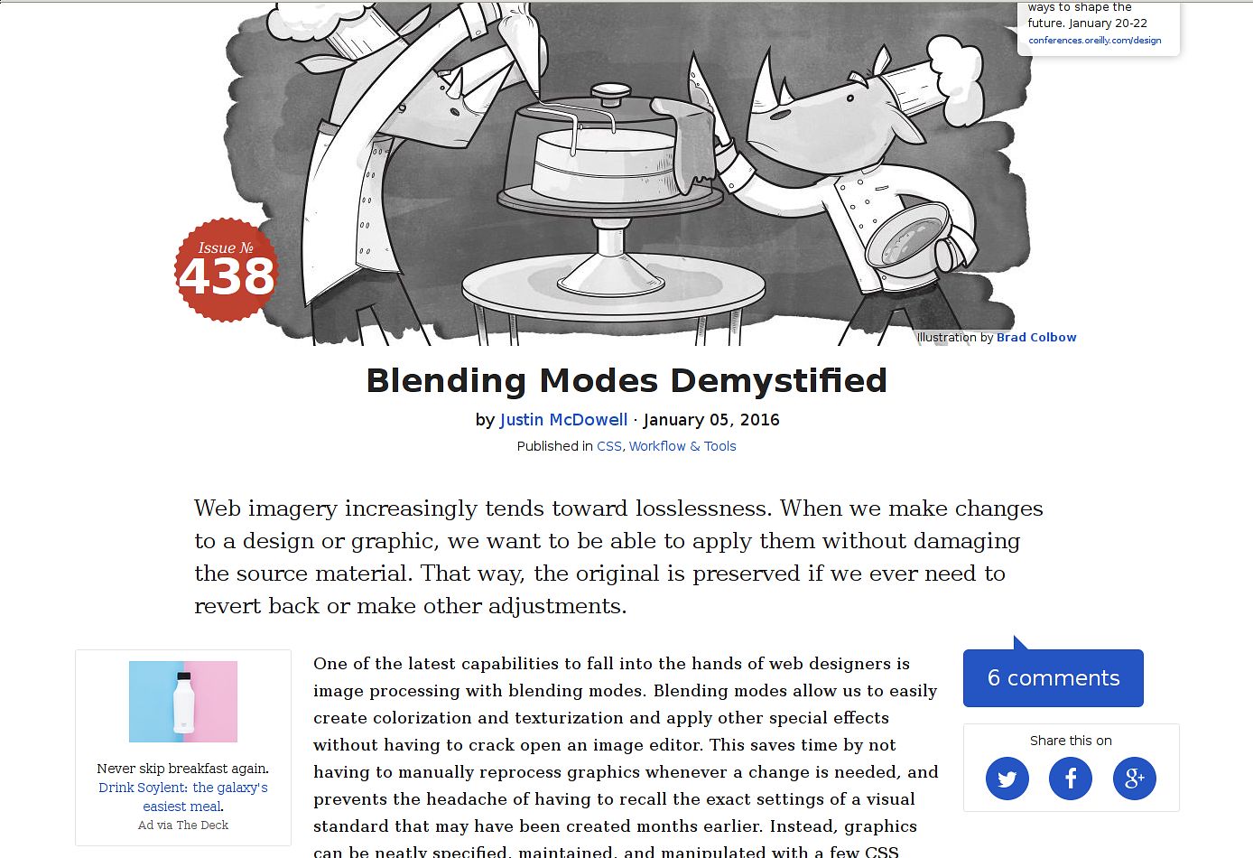
Alistapart: Needlesly Large Webdesign
Note: This is my opinion only.
Alistapart.com is a great site where to get information on webdesign and web technologies in general. Check it out!
On the other hand I love compact webdesigns. I don't like to scroll. I like to read. I use compact view in Gmail.
During iPad 1/2 hype (cca 2013), they've changed their design to a tablet one. It's fucking big. Font is big, line heights are too wide. I don't have an iPad, but on my 96dpi desktop it looks riddiculous and on Xiaomi Redmi 2 smartphone it looked and still looks the same.
I just wanted to capture this kind of webdesign. It brought a fresh wind to the internet and I respect it, but also I'm avoiding these types of designs, because my values are a bit different.


Add Comment